Build Your Own Analysis Dashboard
Every athlete cares about different numbers. A marathoner wants pace curves and weekly volume; a cyclist lives on the power curve; a triathlete watches all of it plus sleep and body metrics. That’s why TrainerPlan’s analysis dashboard is yours to assemble: pick the charts that matter to you, arrange them your way, and they update automatically with every synced workout.
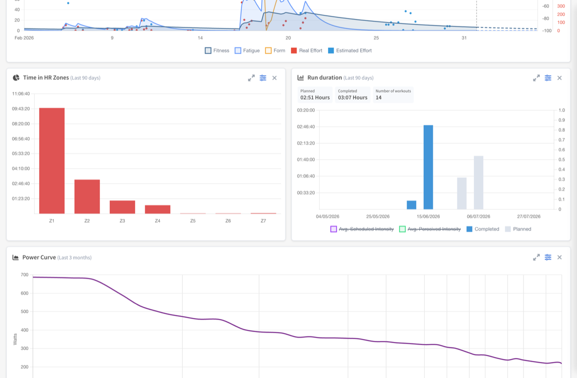
Add your first charts
- Open your dashboard (on mobile, the Analysis tab).
- Click Add chart to open the chart library.
- Pick a chart and it appears on your board instantly. Add as many as you like.
- Drag charts to reorder them, expand any chart to full screen, or remove it with one click — your layout is saved to your account.
What’s in the chart library
- Training: distance, duration, effort, elevation and performance over time — with planned vs. completed comparisons.
- Zones: time in heart-rate, pace and power zones across any period.
- Curves: power, heart-rate, pace and cadence curves, built automatically from every workout.
- Peaks: your best efforts and how they evolve.
- Strength: your gym work, tracked alongside your endurance training.
- Body metrics: weight, muscle mass, sleep, HRV, resting heart rate, VO₂max and more.
Each chart has its own period selector, so you can watch your power curve over 90 days next to a season-long fitness chart.
For coaches: one board per athlete
Coaches get an independent chart board for every athlete. Set up a cyclist’s board around power and a runner’s around pace — each athlete’s page remembers its own selection and order, so the numbers you need are always the first thing you see.
Availability
The analysis dashboard is available on web and in the mobile app. Some advanced charts are part of Athlete Premium — if a chart is locked, upgrading unlocks it instantly, along with the rest of the Premium analysis features.